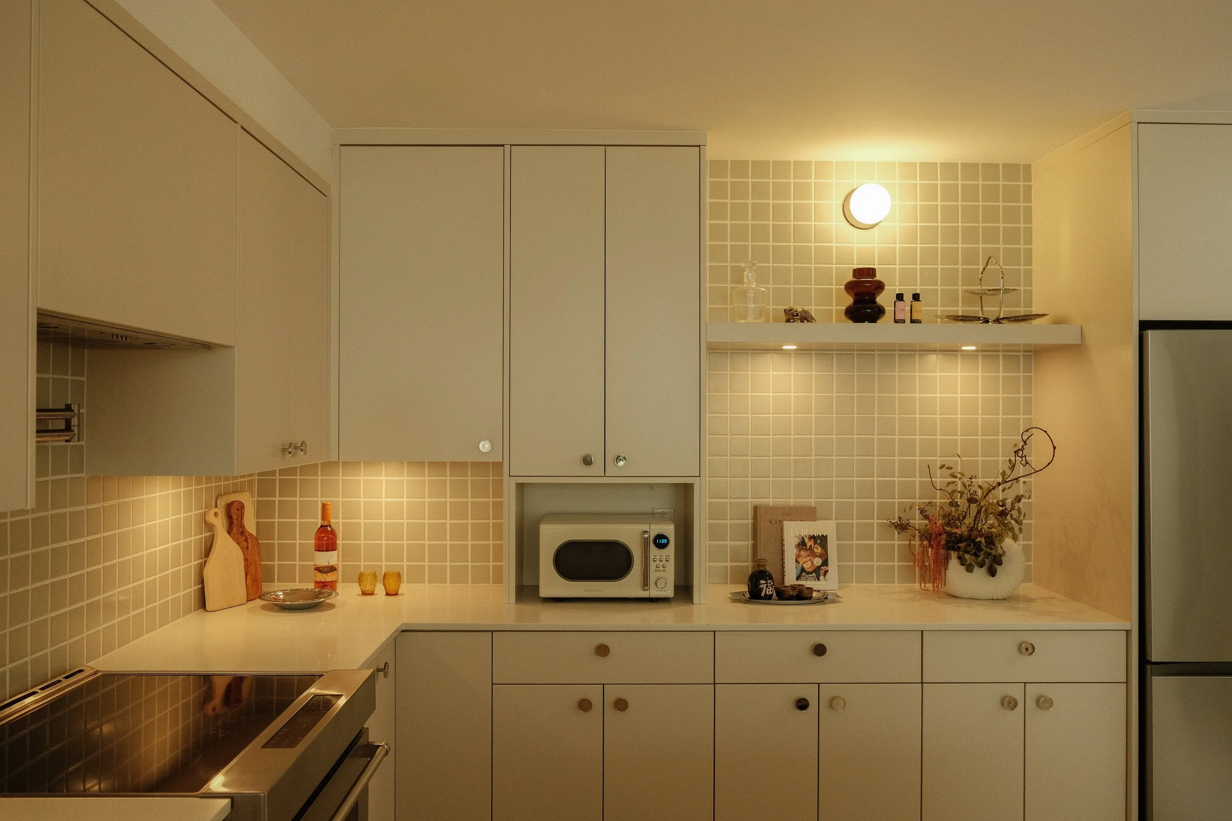
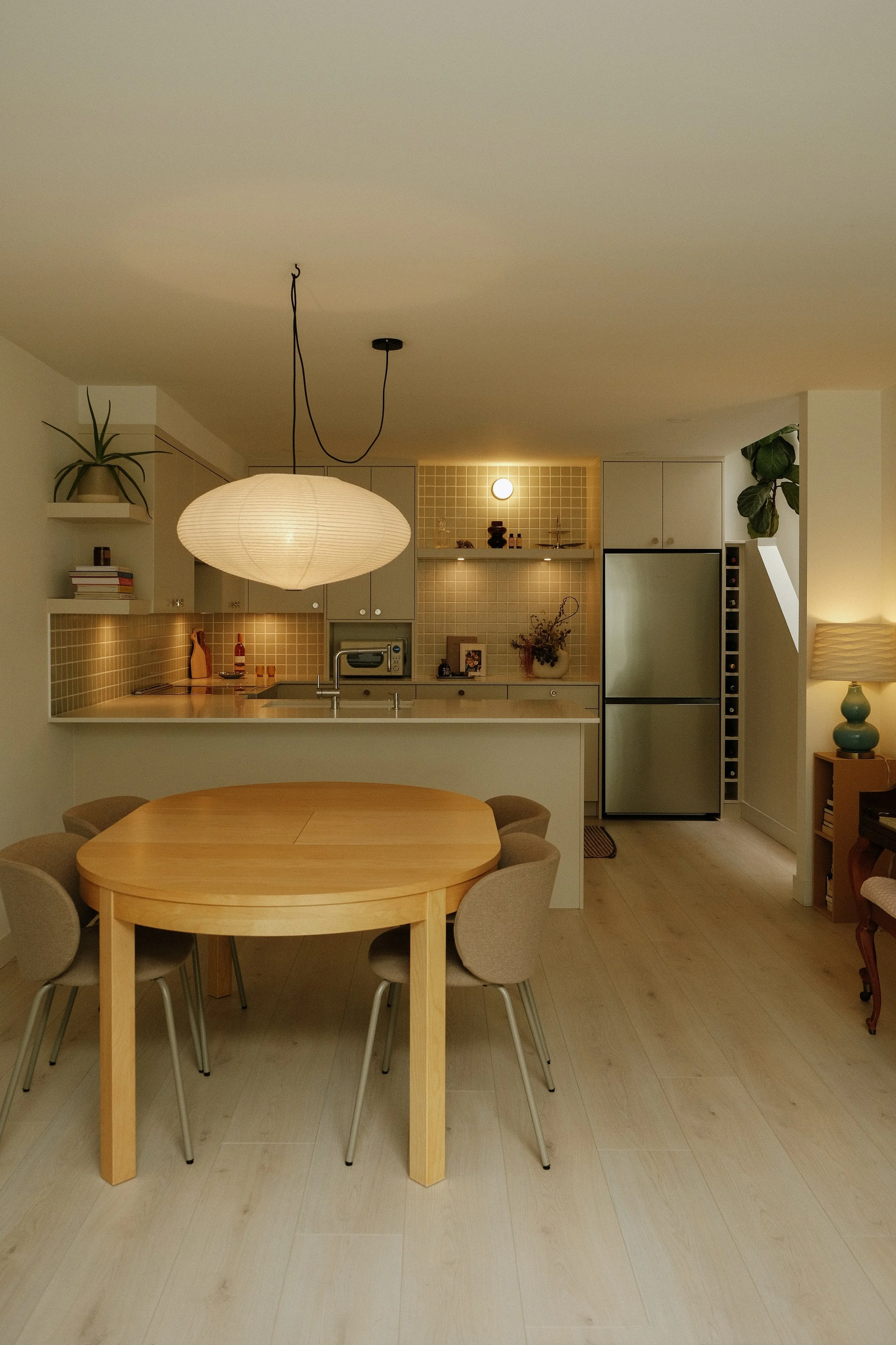
Main Street is a sun-drenched reimagining of a 1970s Vancouver home, designed for a creative couple inspired by art, music, travel, and California living. Studio Poppy led the gut renovation and redesign of the main floor, rethinking the kitchen, spatial flow, and material palette to create a home that feels warm, intuitive, and effortlessly lived-in. Natural textures, warm woods, soft tonal finishes, and abundant daylight bring a relaxed West Coast sensibility while honouring the home’s original character.
Client: Private Residential
Location: Vancouver, BC
Collaborators: Derrick Pham Photography, Kado Flower Studios
If this home was a playlist…
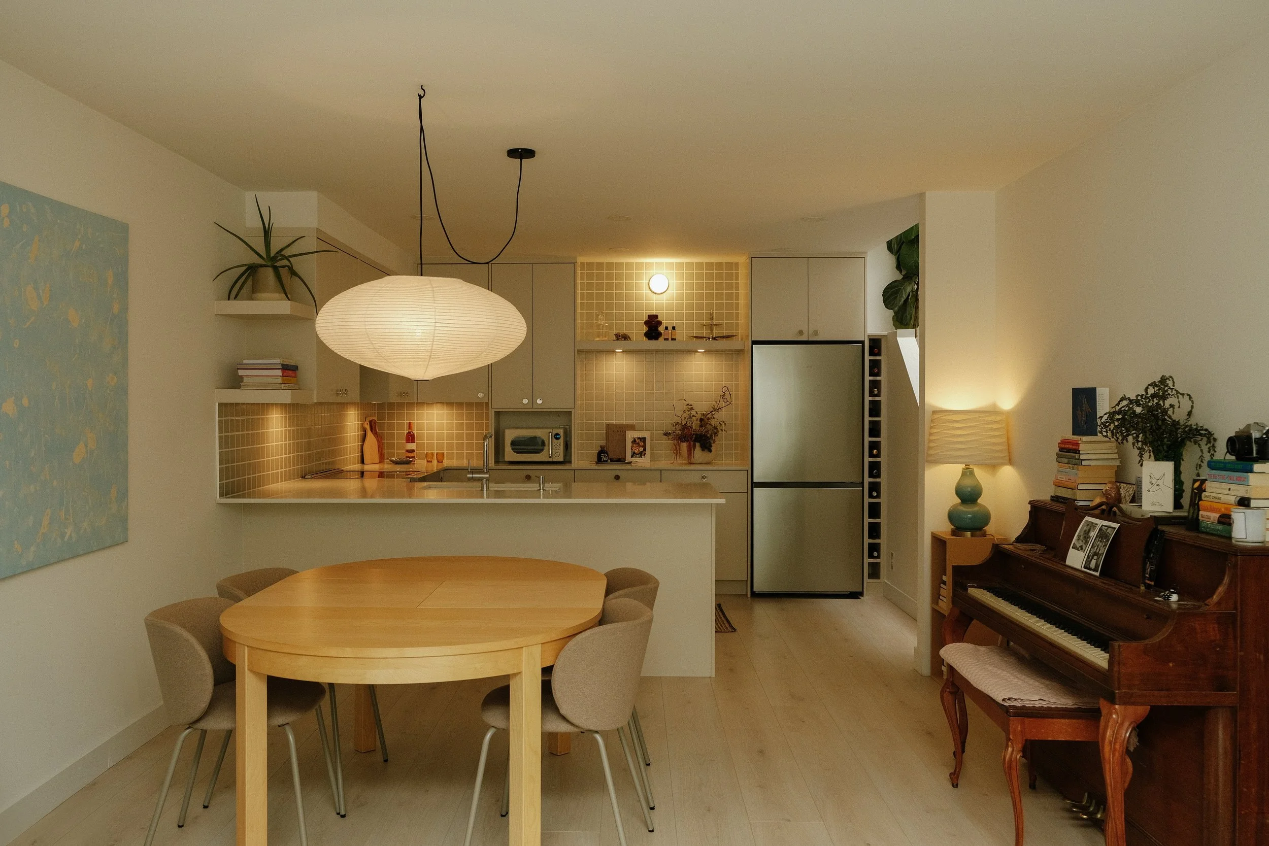
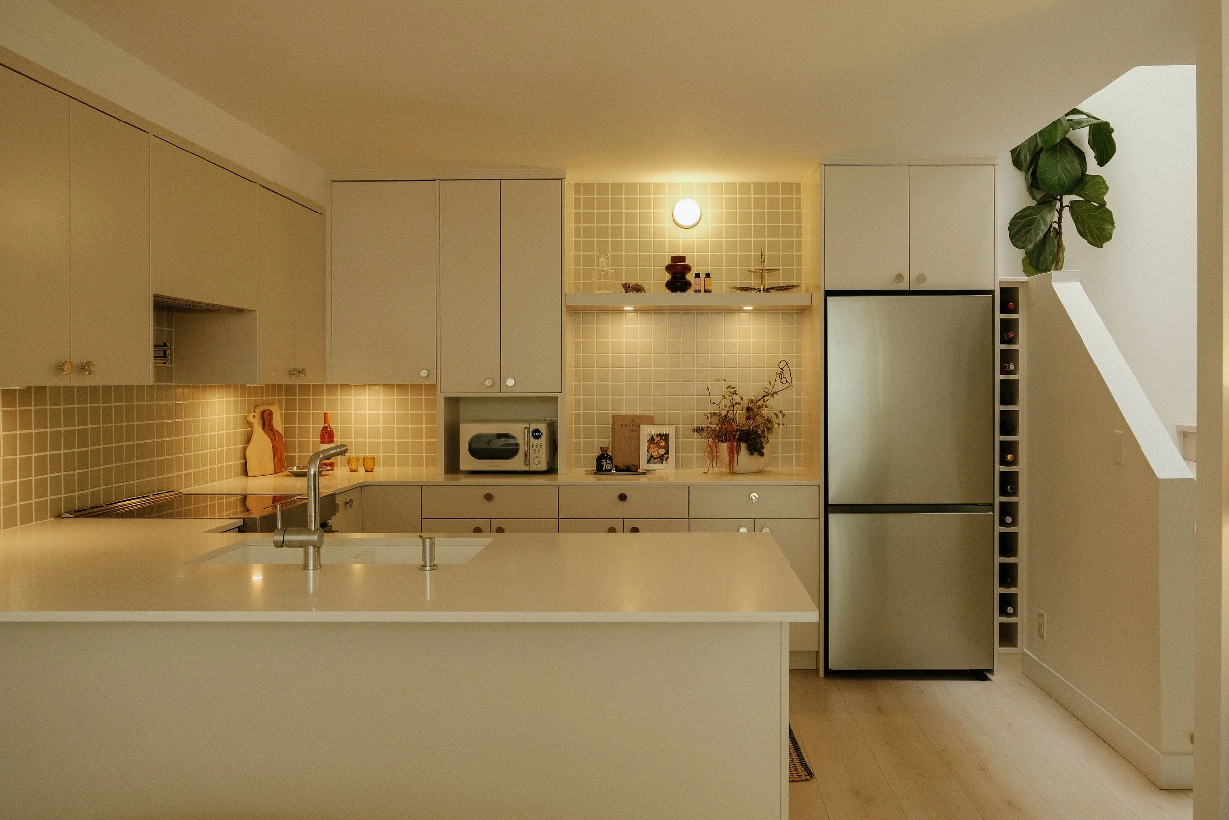
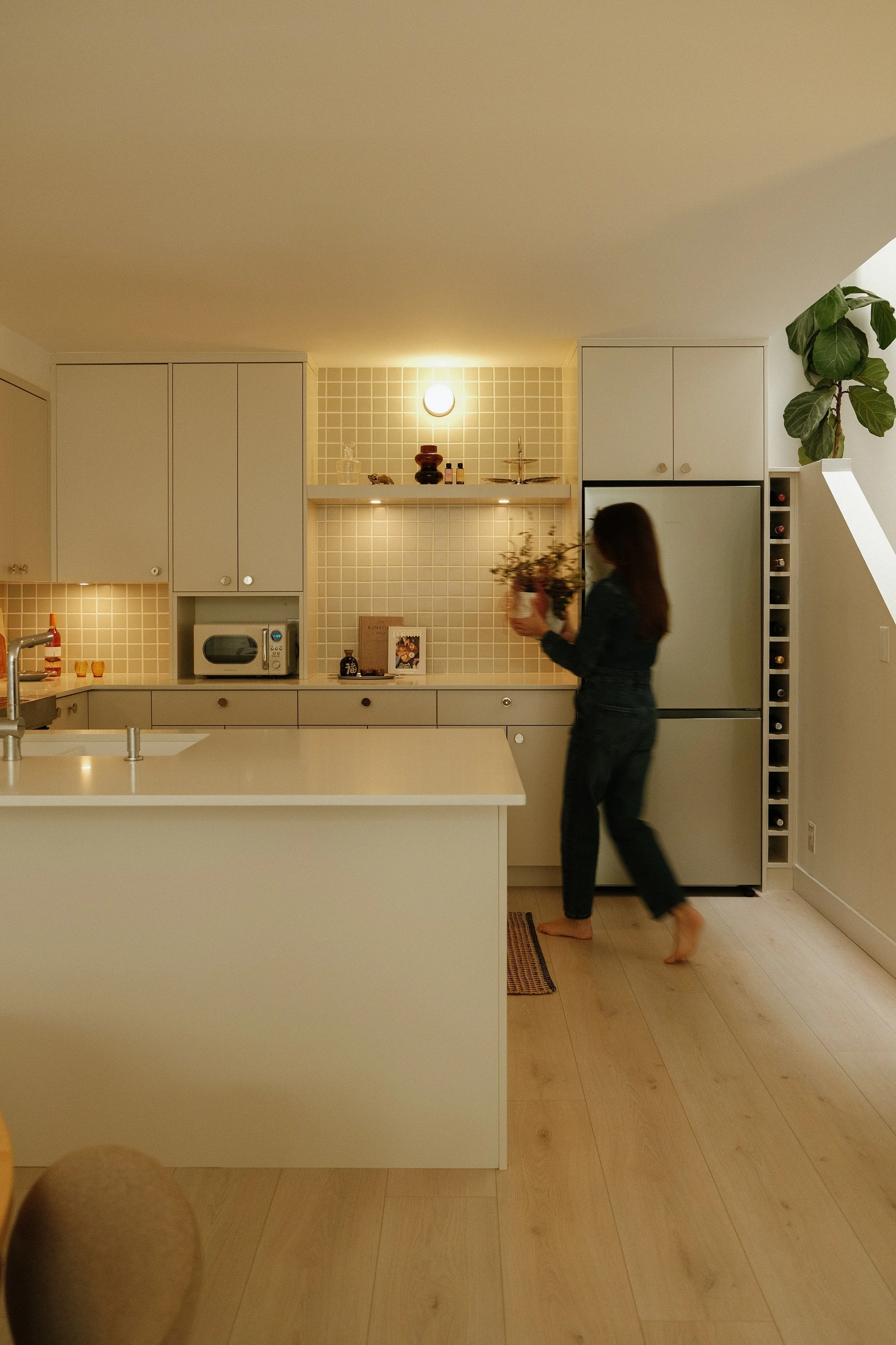
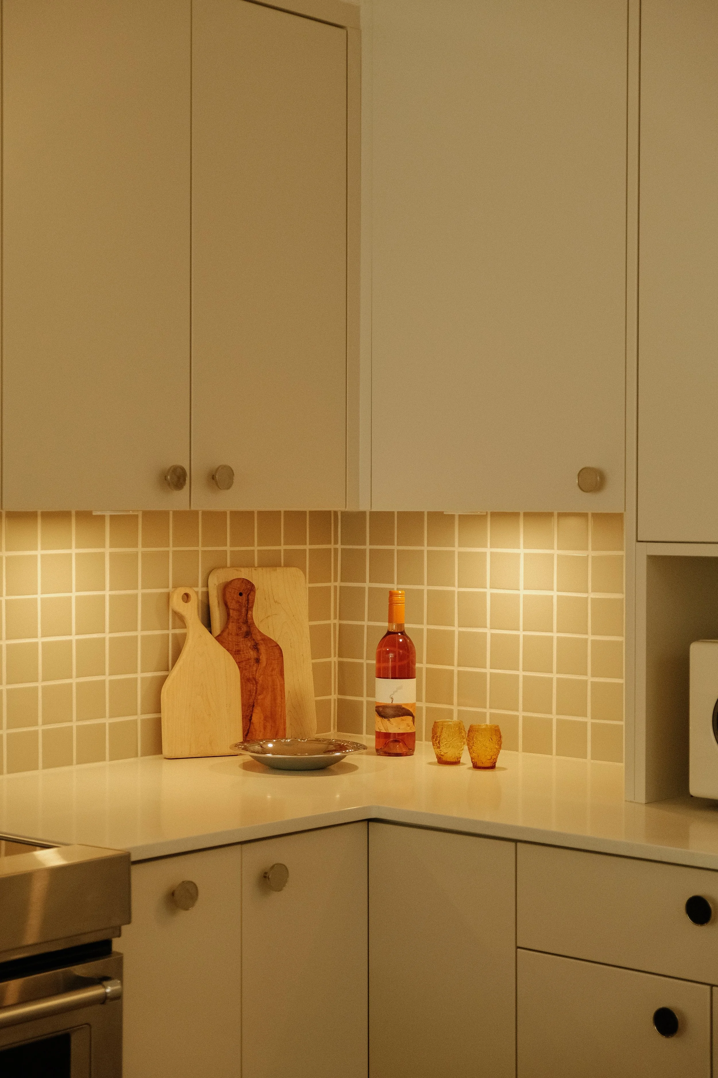
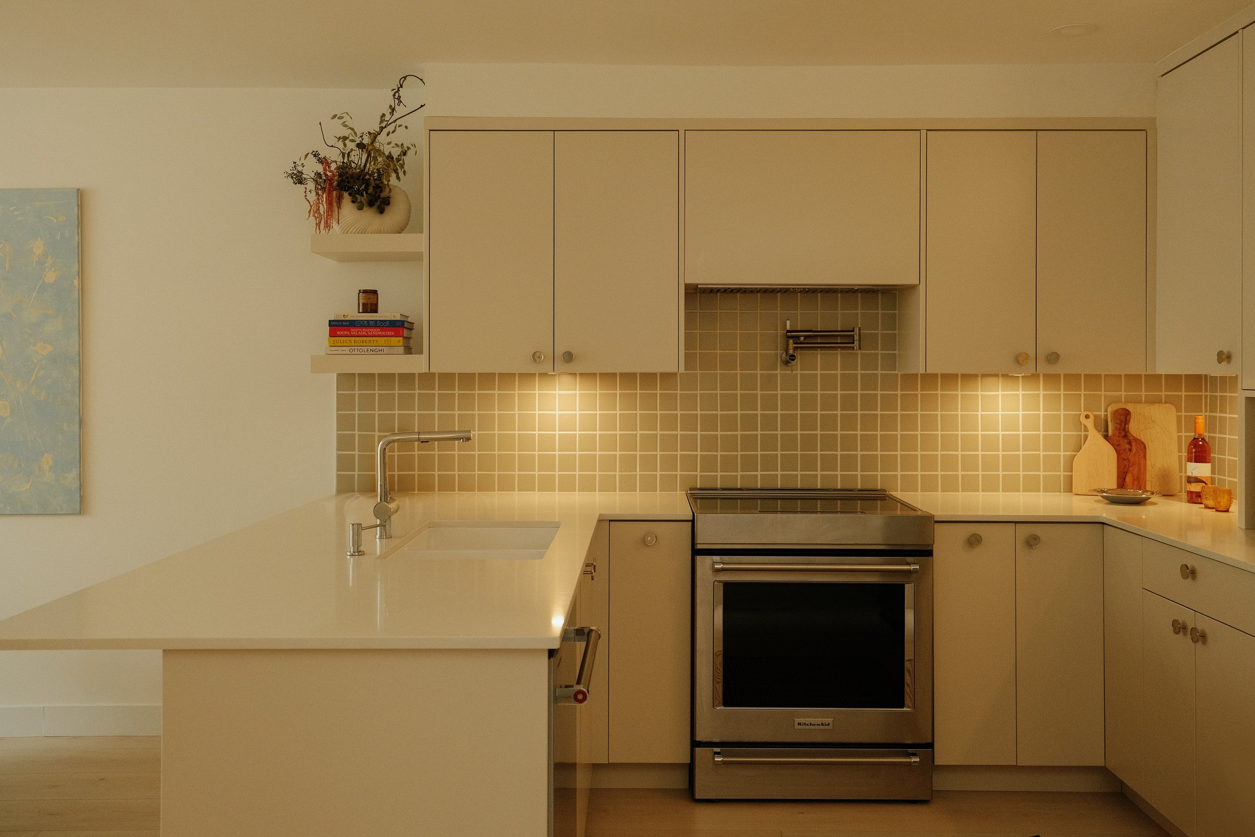
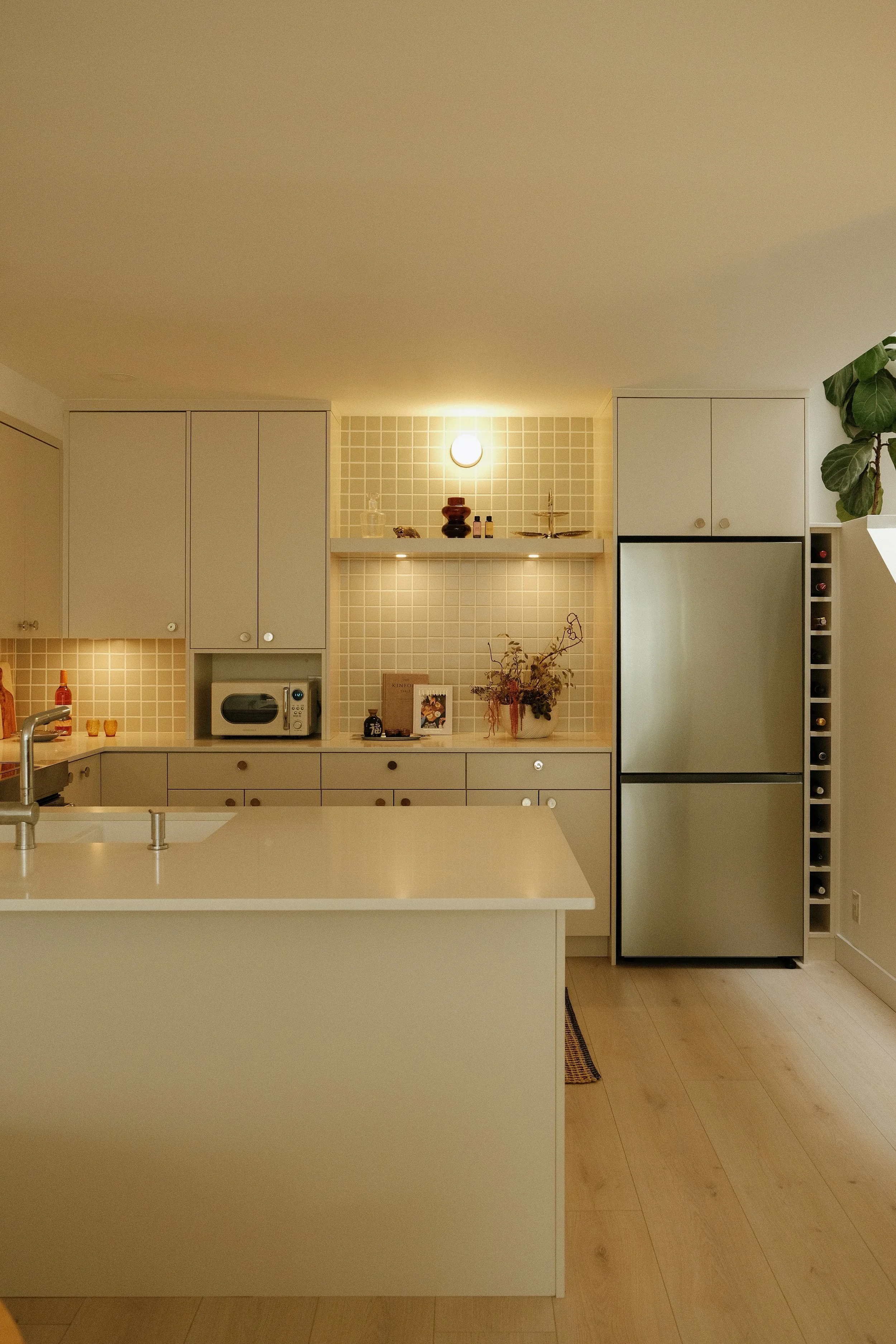
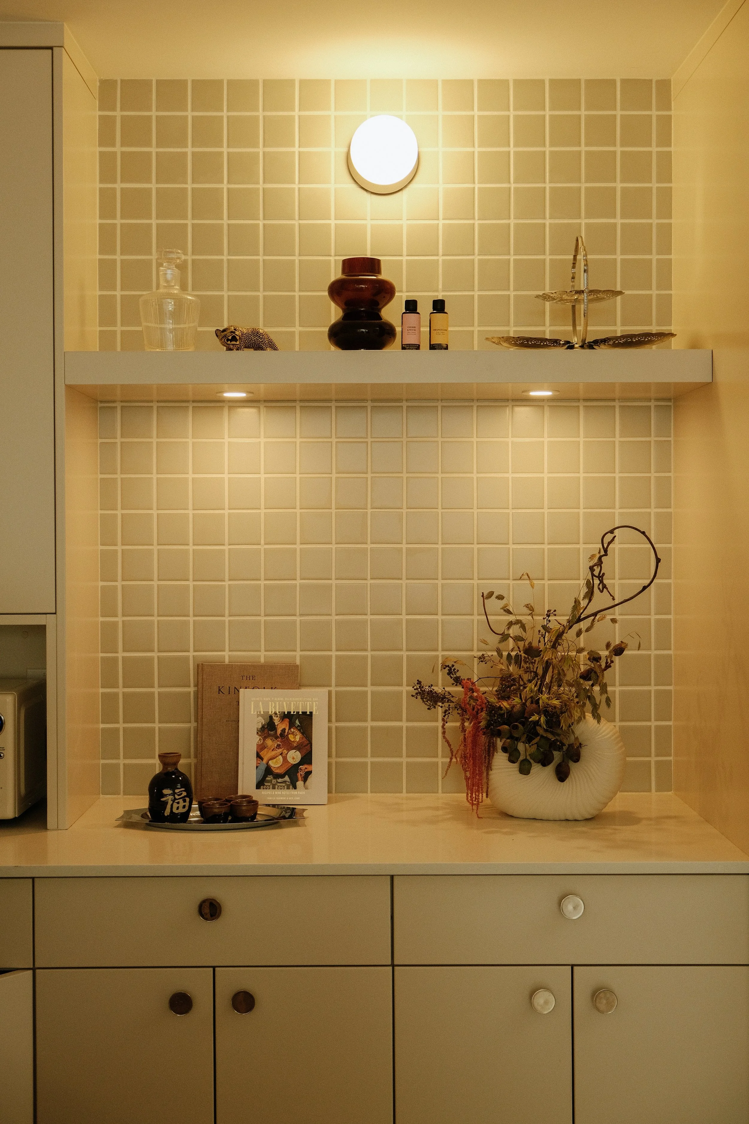
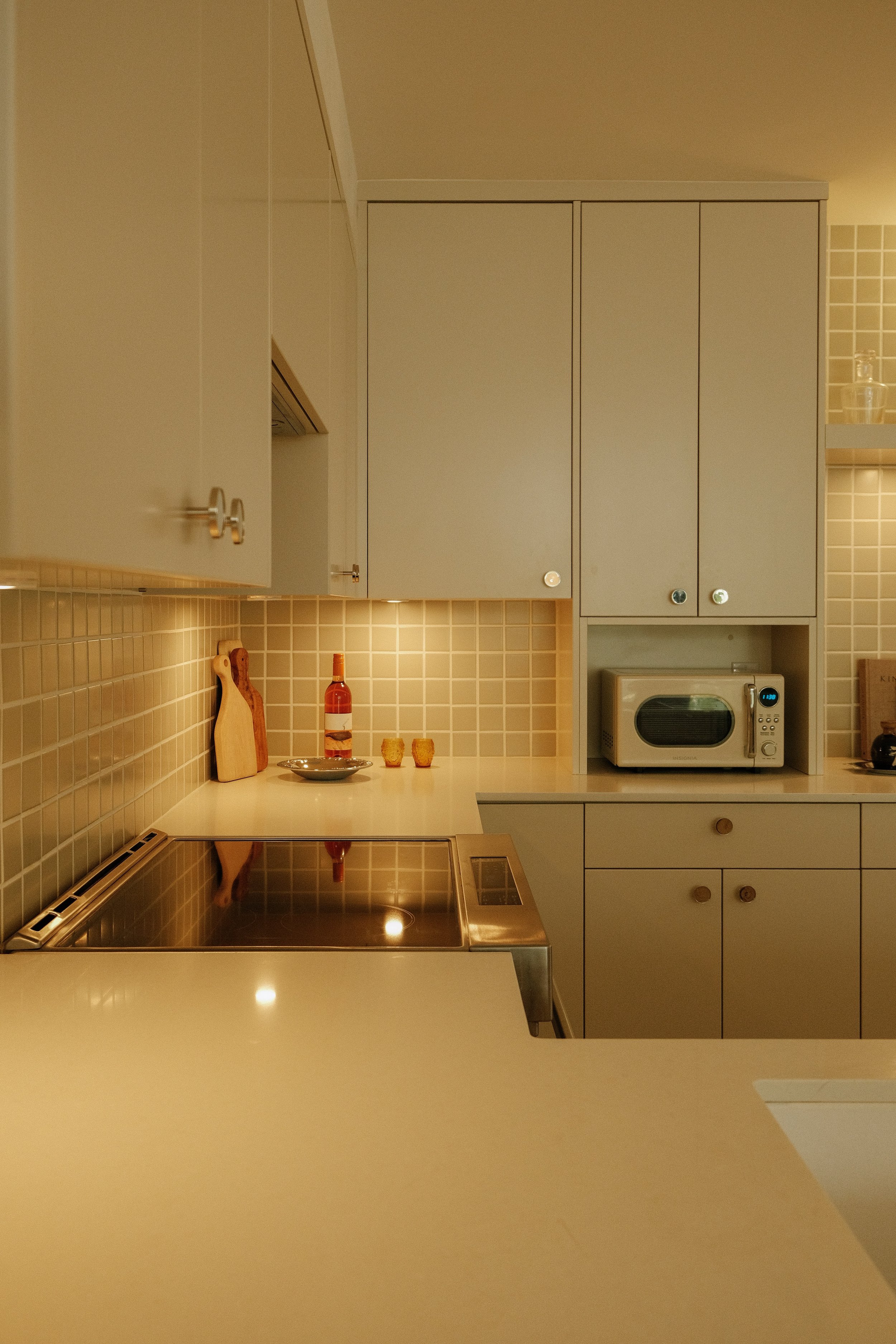
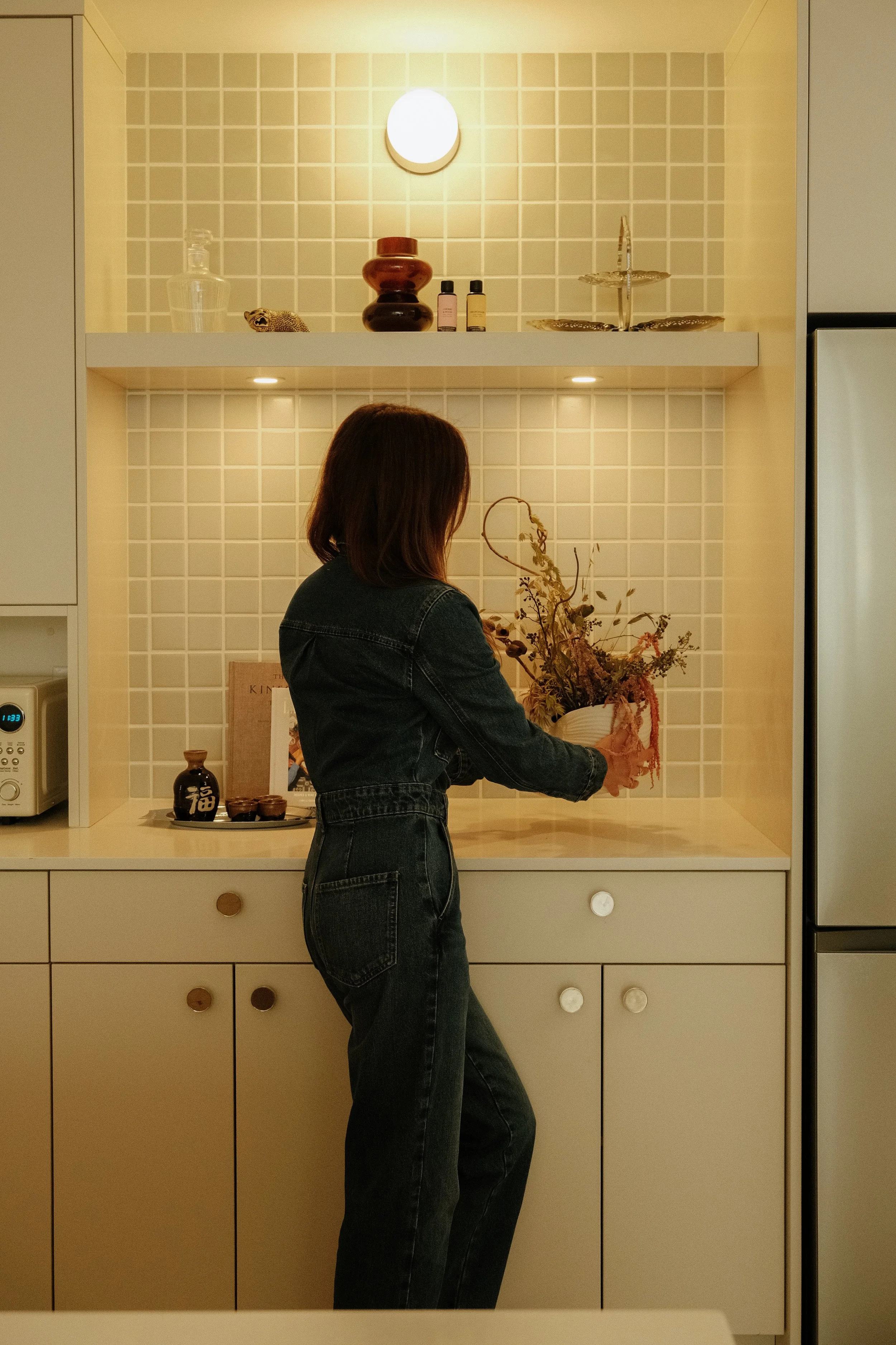
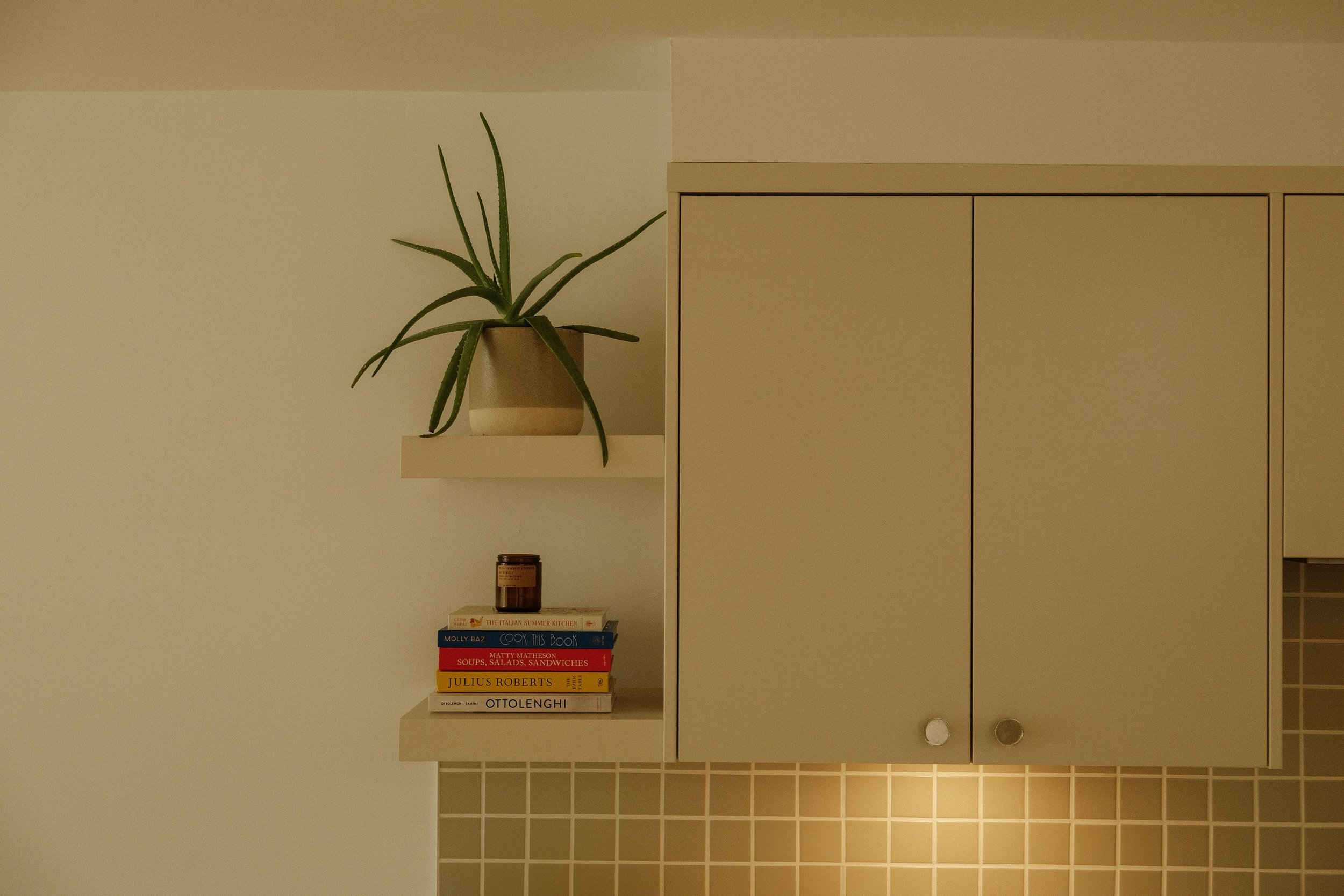
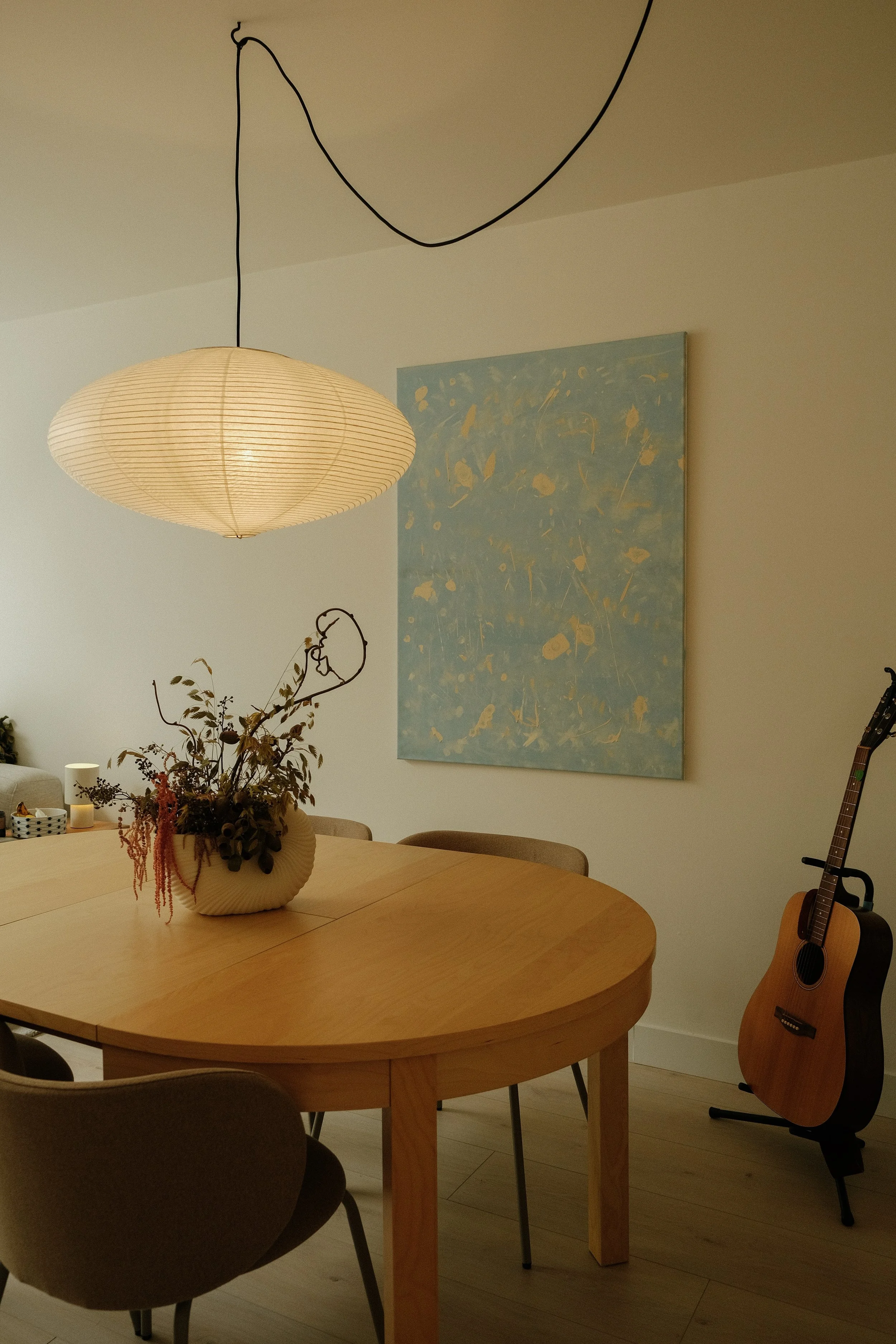
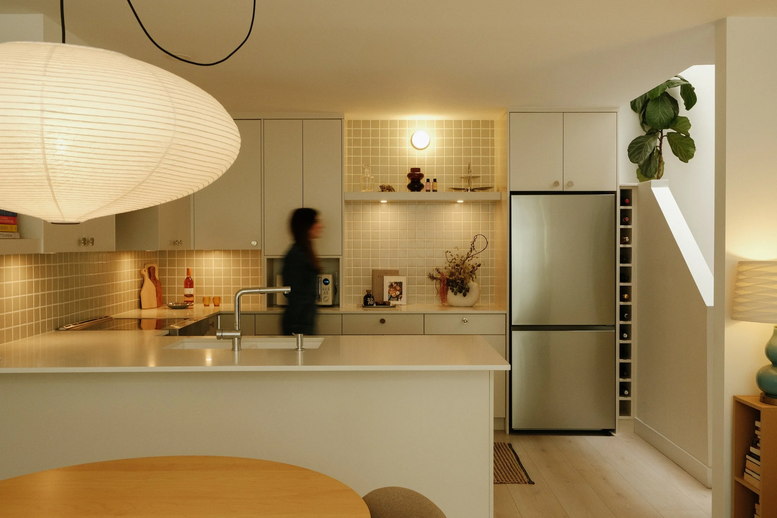
Design Opportunity.
Some of the best design moments begin with a constraint. Throughout the Main Street renovation, existing architectural conditions challenged us to think beyond the obvious — transforming otherwise awkward or underutilized spaces into thoughtful details that improve both the function and experience of the home.
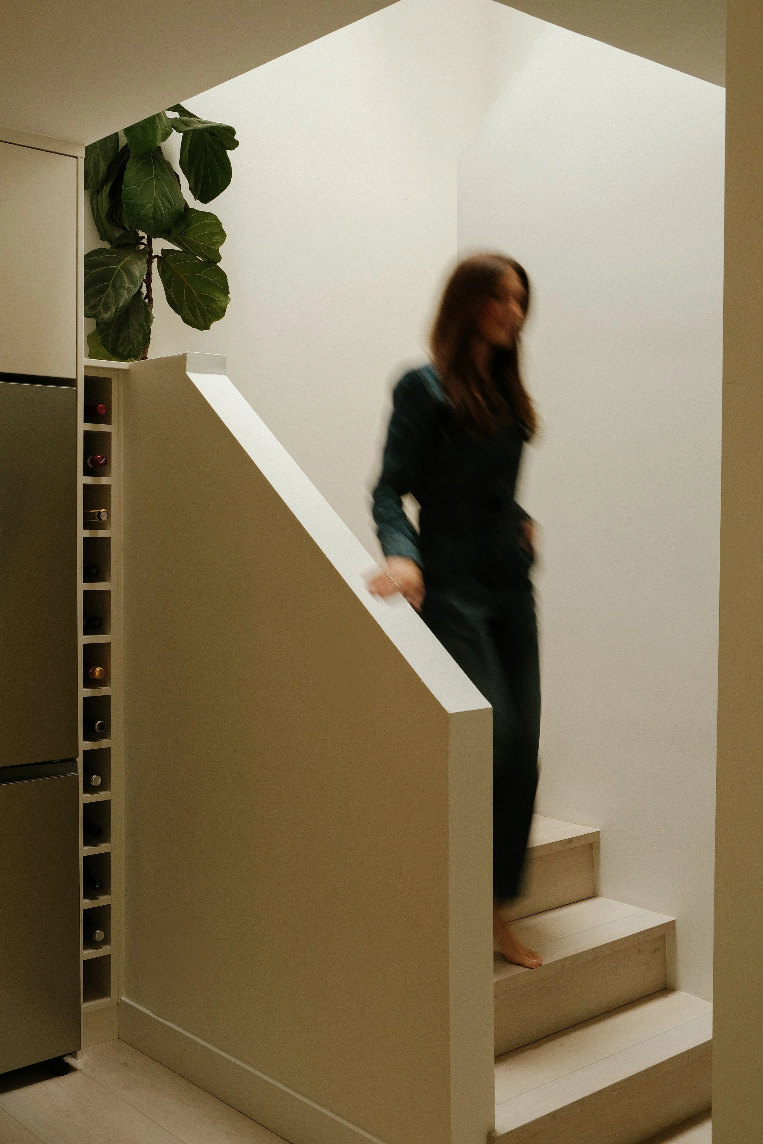
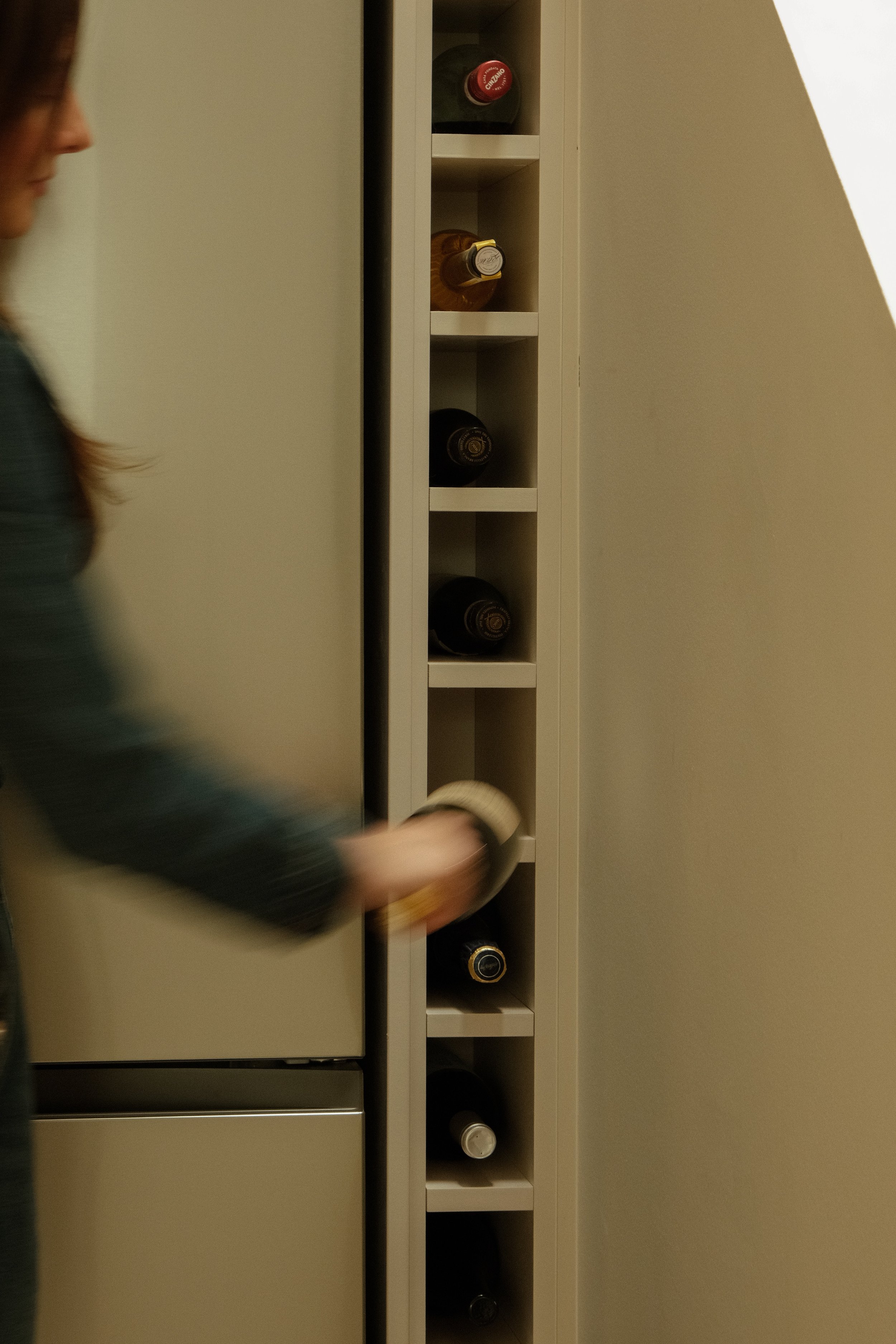
01 — From Dead Space to Wine Storage
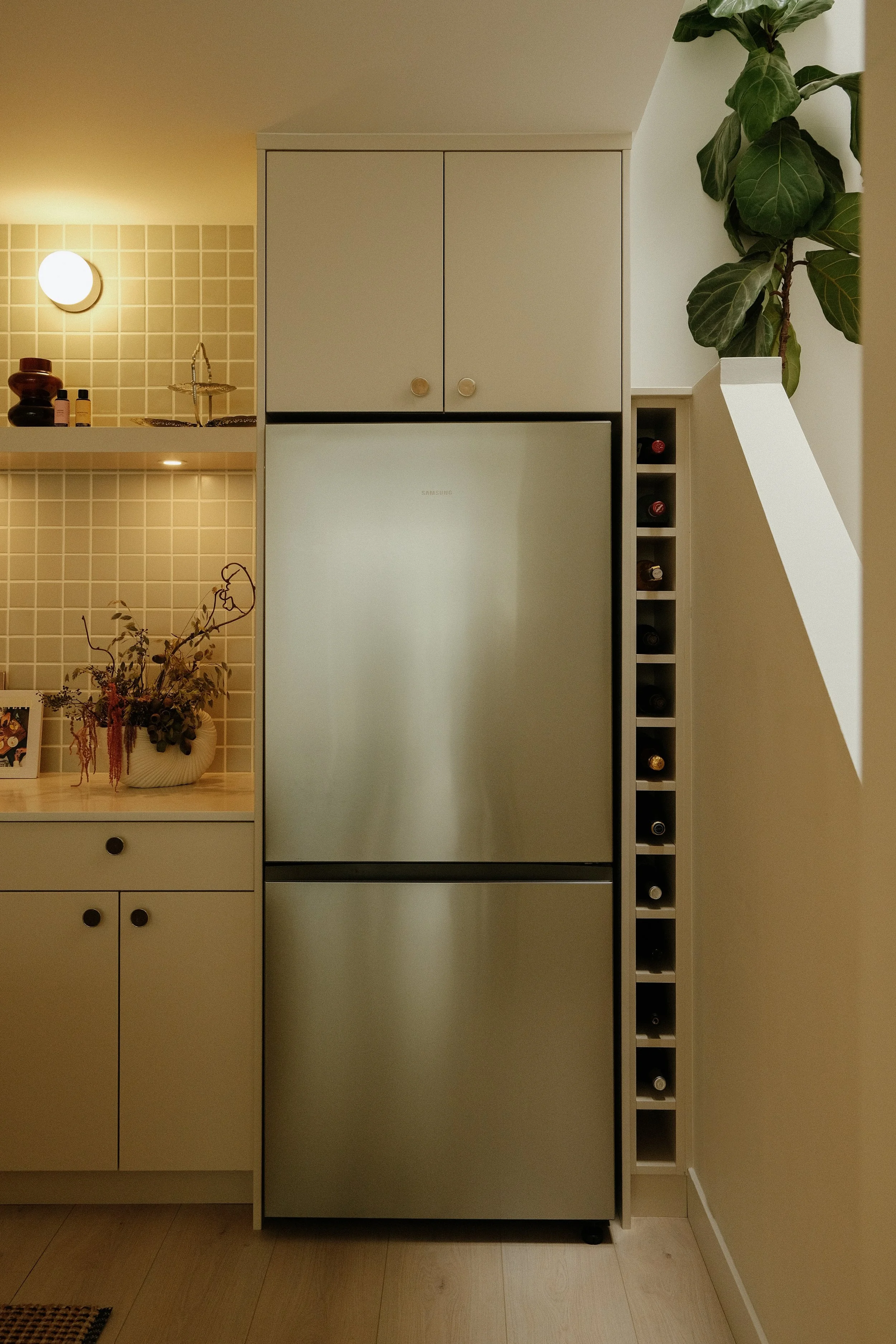
An existing wall condition beside the staircase left approximately eight inches of unusable space directly adjacent to the new refrigerator — too narrow for conventional cabinetry, but substantial enough that leaving it empty would have made the kitchen feel unresolved. Rather than treating it as a compromise, we transformed the void into a custom built-in wine rack. The new feature uses every available inch while creating a more balanced, intentional transition between the refrigerator and surrounding architecture.
02 — Making Every Inch Work
Two narrow cabinets flanking the range presented another opportunity to rethink conventional storage. At less than a foot wide, standard shelving would have been difficult to access and inefficient to use. Instead, we designed slim pull-out cabinets that turn those inches into highly functional storage for everyday cooking essentials — from olive oil and spices to cutting boards. Everything is kept within arm’s reach of the range while maintaining the clean, symmetrical appearance of the kitchen.
03 — Designed for the Way They Gather
For a couple who loves to cook, host, and bring family and friends together, the kitchen needed to support both the making and the gathering. Rather than asking the peninsula to do everything, we created a dedicated prep space where meals can be assembled, ingredients spread out, and dishes brought together without disrupting the social heart of the kitchen. This allows the peninsula to remain open for guests to pull up a seat, pour a drink, and be part of the action — creating a natural separation between working space and gathering space without ever disconnecting the two.
The Before.
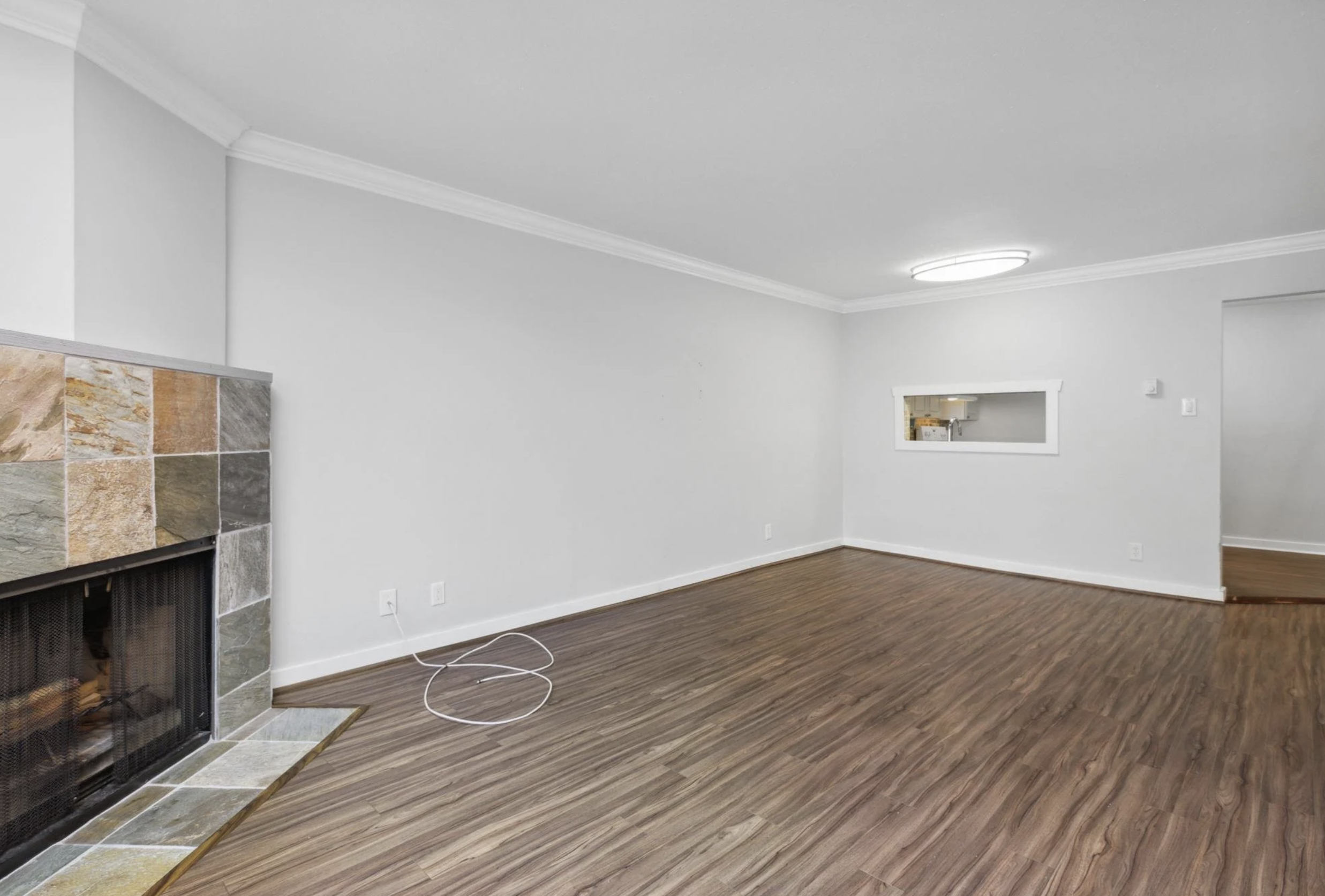
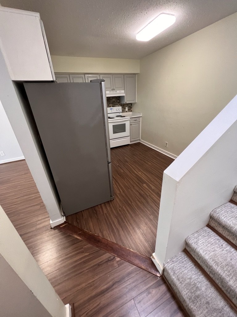
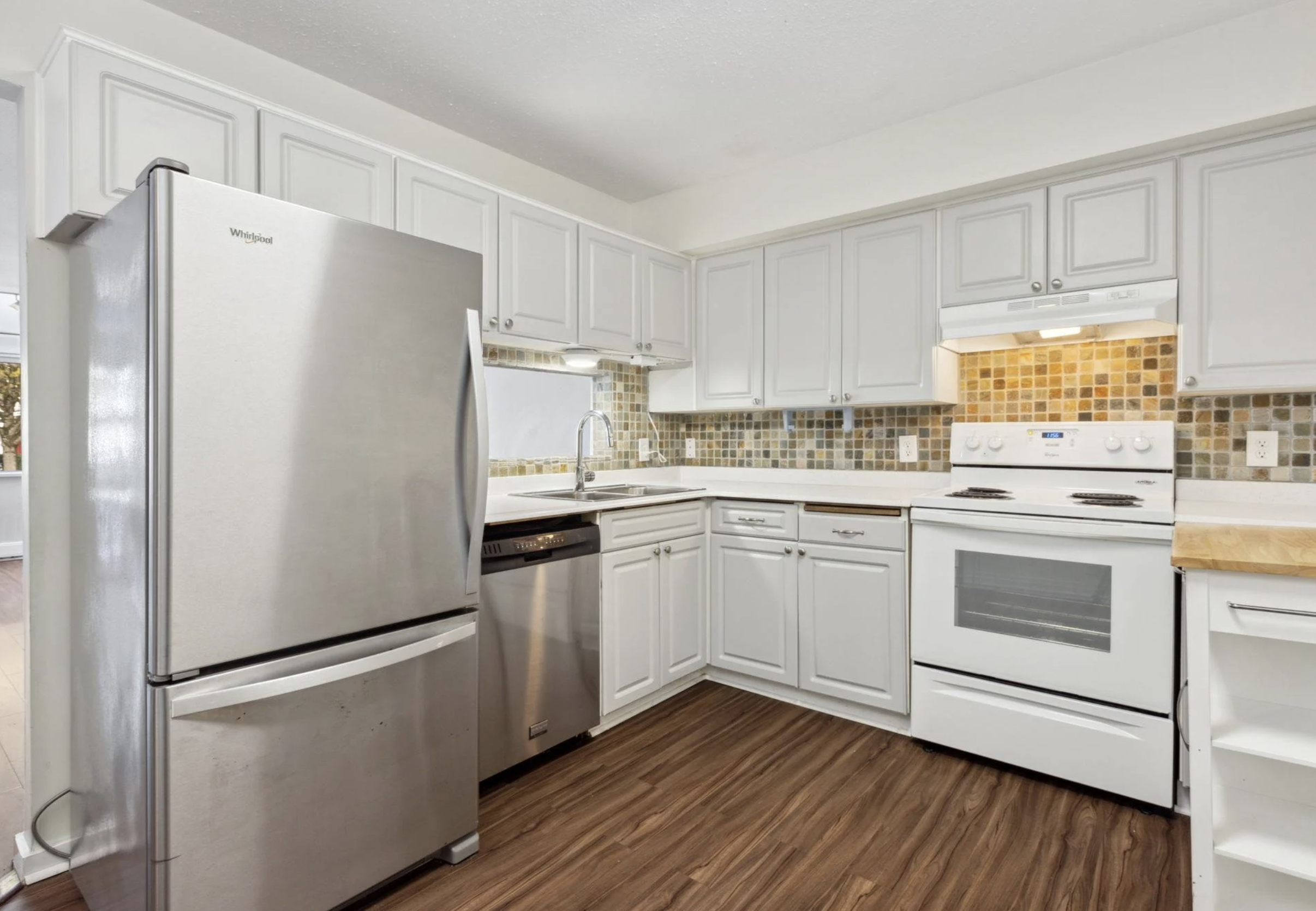
Before the renovation, the main floor felt dark, disconnected, and underutilized. A series of closed-off rooms limited natural light and created an awkward flow between the kitchen, dining, and living spaces, while dated finishes and inefficient planning made the home feel smaller than its footprint. The opportunity was to open the space up, improve circulation, and create a more functional foundation for the way the homeowners actually live, cook, and gather.